Today we’re going to go through a simple tutorial for creating pet sitter business cards which anyone can do. The tutorial uses Inkscape. You don’t need Inkscape for this tutorial, but I highly recommend it is you wish to follow along. Don’t worry it’s free. I have a page that walks you through how to install Inkscape, so go check that out if you haven’t done so already.
Business Requirements for Pet Sitter Cards
We’ll be creating business cards for a pet sitting business. The reason I decided to do these today is because I have done a few of these over the years and they are always super fun! I love the illustrations since they have cute animals on them. Who wouldn’t? And also, pet sitting is actually a good entrepreneurial endeavor, since most pet parents want to know their furry friends are well cared for when they aren’t home, or they’re on vacation. And while I am aware that there are literally tons of business cards for pet sitters and other options out there, you won’t find any as cute as the ones we’re going to be making today. Guaranteed!*
So before we begin let’s answer a few questions?
- Who are you?
- Katherine Smith (for the sake of today’s tutorial)
- What’s your job title?
- Can be: pet sitter, dog walker, etc. Basically what services do you offer.
- What’s your contact info?
- You need at least a phone number for calls or messaging. An address if you run a brick and mortar shop. Social media is also a good idea, but not an absolute must.
Design a Business Card In Inkscape
Setting the Document Size
Before we begin we need to check that the document size is correct. We’ll be working with US letter size. So the first thing is to ensure that you’ve set your document size to “Letter” which is 8.5 x 11 inches. Do this by clicking the document properties icon found at the top of the screen if you have the default view set.
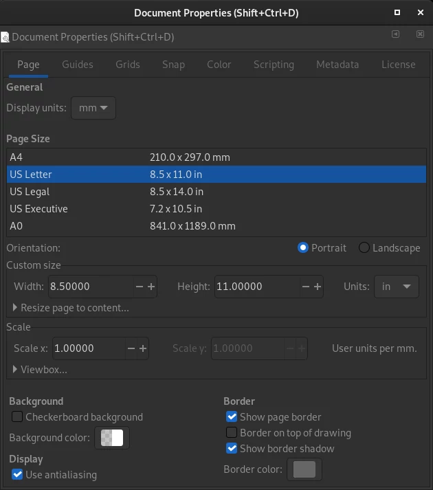
The generally agreed upon size for a business card 3.5 inches in width by 2 inches in height (88.9 mm x 50.8 mm). With this size of document you can either do 8 business cards with whitespace (padding around each card) or 10 cards tightly stacked together. What do you need? Actually this depends on the type of paper you want to print on. As a rule of thumb, make sure that there is enough whitespace (8 cards) when you print on glossy paper. And if you opt for a matte paper you can go with the 10 card layout. Don’t worry, we’ll be doing both today.
Choosing a Design for Your Business Card
Alright, since we are going to be doing a pet related theme we need something that will reflect that in design. Since business cards are a smaller format you don’t want to overload them with graphics. That’s why I like to opt for vector graphics. And since we’ll be using Inkscape (a vector graphics app) everything will be that much easier.

As you might have already realized this tutorial will work for any business card you may possibly want to design. You just need to adjust the graphics to suite your needs.
Setting up Our Canvas
Now that the size has been setup let’s add some guides around the page. Click “Edit” -> “Create Guides Around the Page”. You know it worked when you see blue lines appear around your page. We’ll be using these to ensure that everything stays aligned when we’re working with the business card layout. You can the Inkscape guides off at any through the hotkey “|”, that is a pipe symbol, or by going into “View” -> “Guides”.
Importing Graphics into Inkscape
Now that we have are base graphic ready, you can begin setting up the document. To do that download the image and import it into your document in Inkscape. You can either pull it into the application, or you can click “File” -> “Import”. Either way you will see the same menu. This menu.

Click on the option “Link the SVG file in an image tag”. This only links the file with your current document so you need to make sure you don’t move it once it has been linked. Also you won’t be able to edit the graphic, but you don’t need to either.
Creating the Front of Our Business Card
Resize the Image
Since our graphic is square we can scale it to the appropriate height of 2 inches. With the imported image selected click on the little pad lock icon to ensure that it maintains its aspect ratio. Then choose “in” so that you are working with inches when you preform your resize and set the width or height to 2.

Congratulations! The image is now resized to the proper height and width.
Creating a Background, Setting Its Dimension, and Positioning It
As I mentioned at the start, business cards usually measure 3.5 inches in width by 2 inches in height. To achieve this, create a box. Press “R” or click the box icon ![]() in the toolbox on the left. Now that you have the tool selected you can draw a rectangular box on the canvas. You don’t need to be exact when you do this, you just need to create it for now. We will resize and position it in just a moment.
in the toolbox on the left. Now that you have the tool selected you can draw a rectangular box on the canvas. You don’t need to be exact when you do this, you just need to create it for now. We will resize and position it in just a moment.
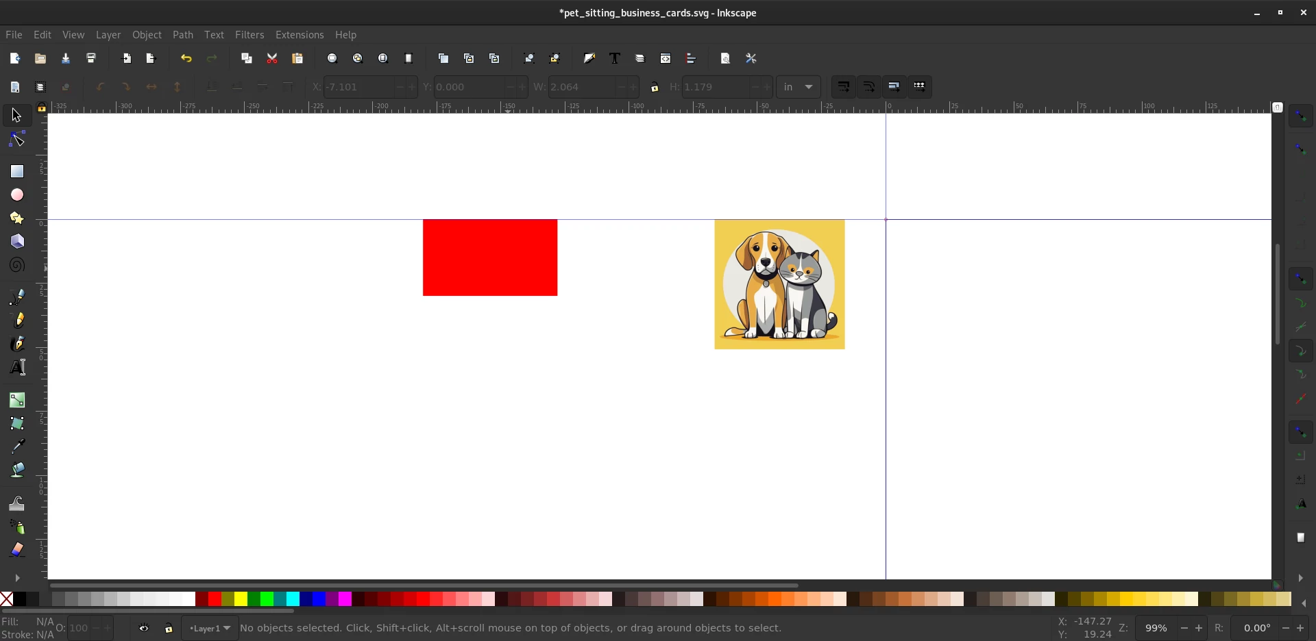
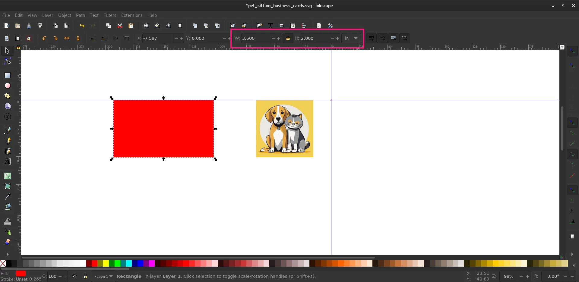
Now that you have the box created which will serve as the background for the business card you need to resize it. This is done in the same manner as with the graphic. The object should be selected, if not click on it to set it as your selection. Go up to the size and un-check the padlock then key in a width of 3.5 and a height of 2 inches.
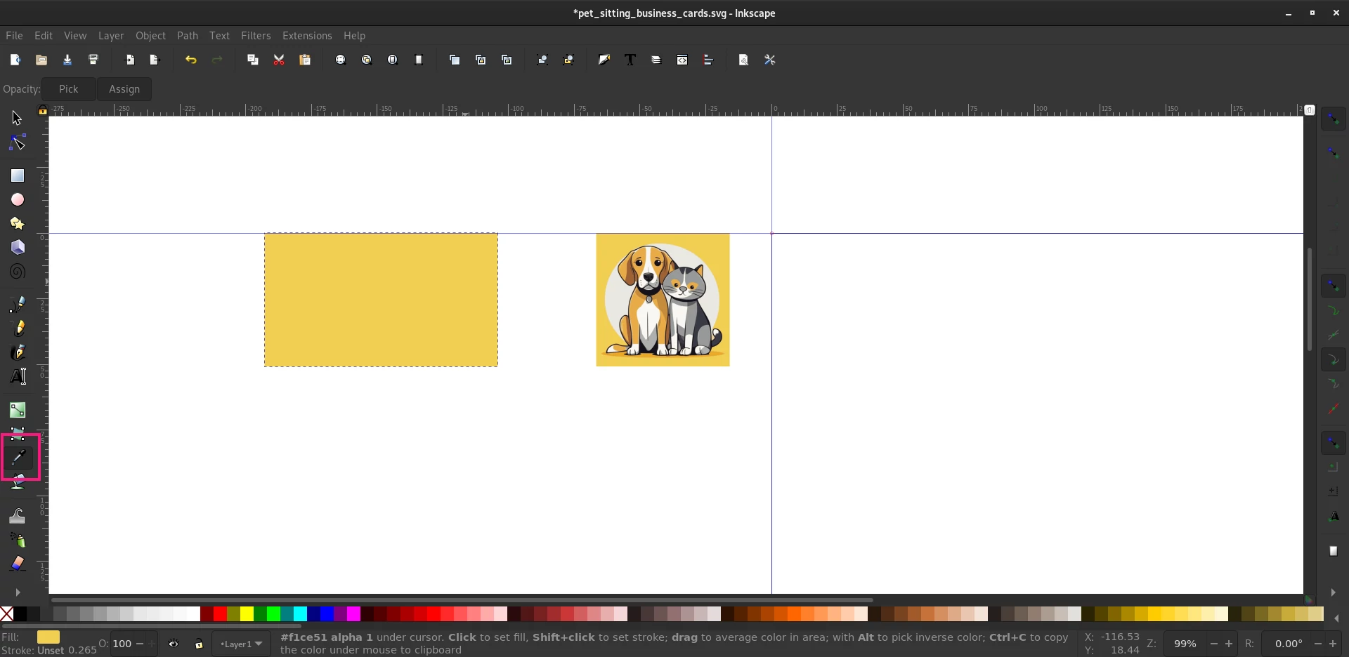
The rectangle should now be the right size and we can change its color. The “Eyedropper” is what you need for this, select it in the toolbox on the left-hand of the application. Once it has been selected go and click into the upper left of the graphic. You should have assigned the rich golden color to the back of the business card and it will seamlessly match the graphic we imported earlier.
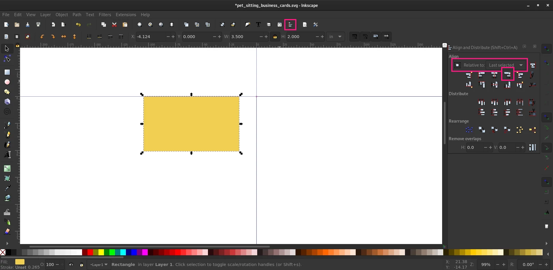
We need to make sure that everything matches up, to do that we need to align the rectangle we just made with the graphic we imported. Now, you could–spend forever trying to get it just right–or just click on the Alignment Panel. We’ll need to ensure that Relative To: is set to “Last Selected” from the drop down menu in the Alignment Panel. Now click on the rectangle, hold “Shift,” then click on the cute pet graphic we imported earlier. Both objects should now be selected. When you click on the “Align Right Sides” button, highlighted in the picture below, you will see that the background aligns to the graphic, and while you may have expected a perfect business card graphic at this point, well. Hey. Those amazeballs are coming. Just hold on.
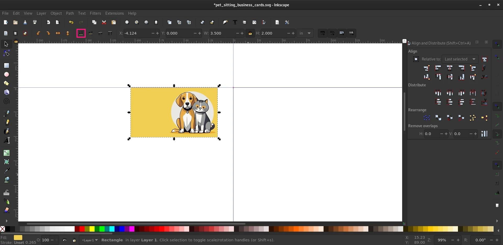
Okay, okay. Wait before you give up. When you work with vector graphics you need to understand that they are individual objects. Think of them as pieces of paper stacked on top of one another. What we are looking at now is the business card background on top of our super cute graphic. We can, however, easily move it down. To do that you can either press the “End” key on your keyboard, or you can click on the icon to “Lower selection to bottom”. Either way you will have the perfect background for your new business card.
Getting Personal or Adding Your Info to the Card
At this point you could call things done, this could be the very nice front of a very nice business card with some text on the back. But let’s take it a step further.
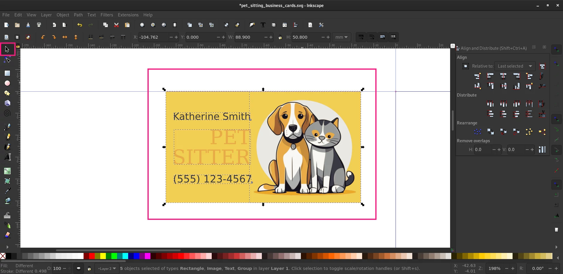
Adding text to a design is easy, we just use the skills we have already learned in the previous steps, namely: object creation (text is an object, too), and alignment. To that end we can quickly and easily create something that looks like this.

Putting A Sheet of Business Cards together
After you are happy with the layout, text, and colors we need to group the design together. Draw a selection around all of our objects and then press “CTRL+G” to group them.
Cloning the Card Design
With the objects grouped we can lay them out however we wish on the page. To do this we will be making clones, not copies, of the business card. You will see why in a bit. To make that clone we need to press “ALT+D”.
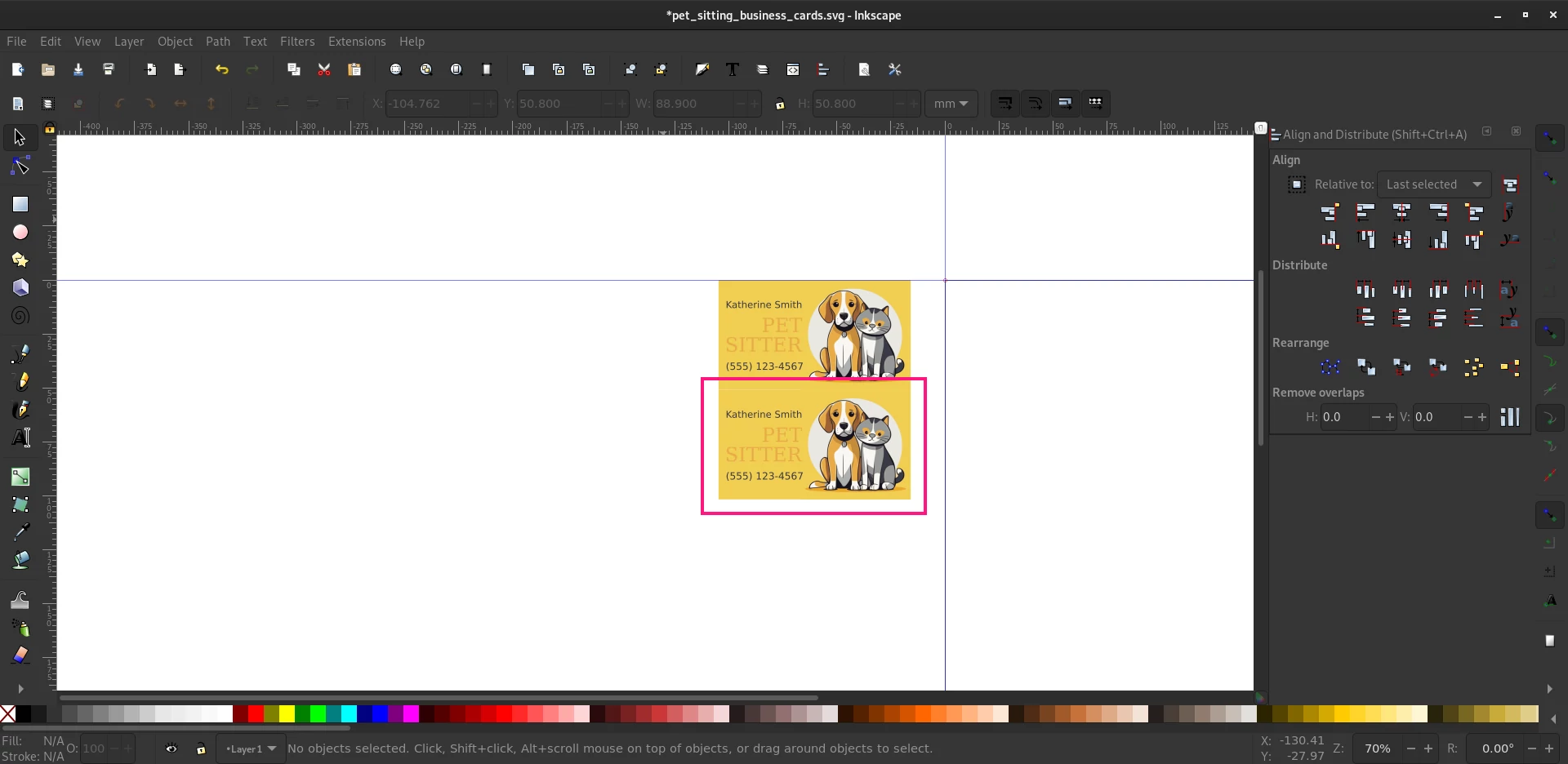
As you can see when we move the top object down we have a perfect clone. Why clones? Well, when you make changes to the source object, those changes will propagate throughout the cloned objects. That means when we want to make changes we only need to do it to one object and not eleven of them.
Laying Out the Page
Add a New Layer
With our clone we can now begin to lay out the page. First, create a “New Layer” by clicking on the “Layer” icon along the top toolbar to open the layers panel. And then click the “New Layer” icon.
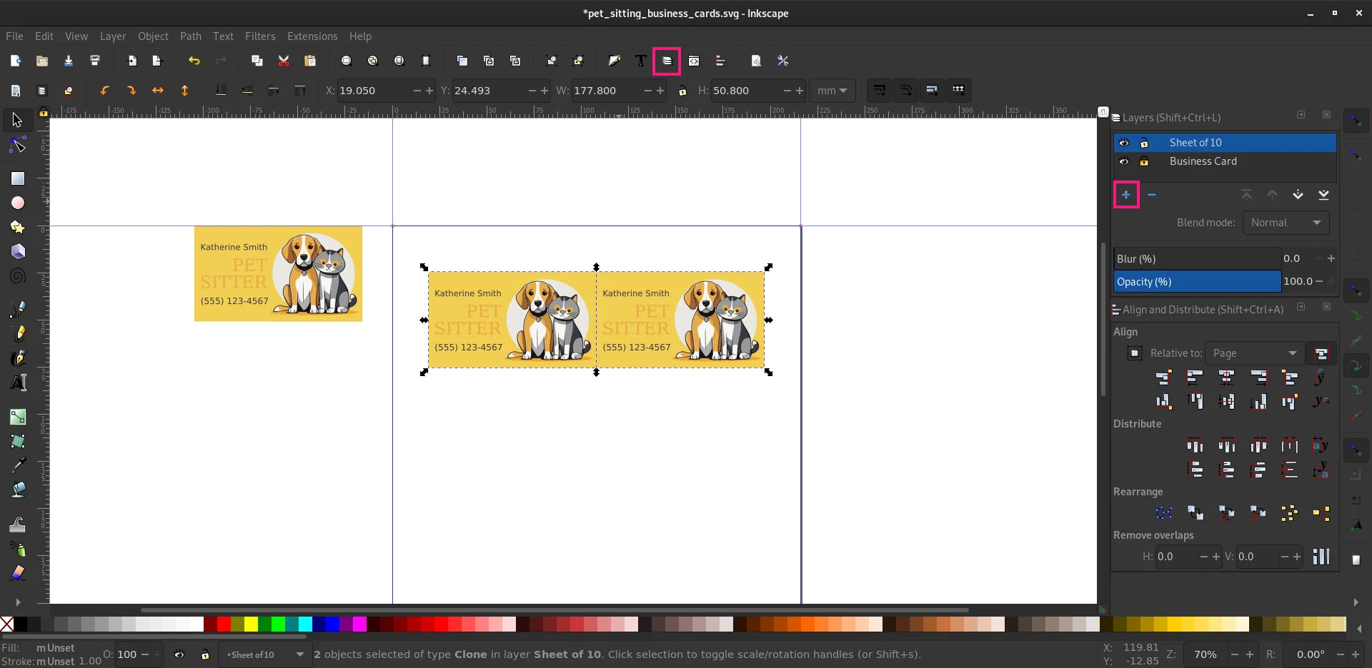
Now that you have a new layer you can cut the objects off “Layer 1” with the shortcut “CTRL+X” and paste it on the new layer. As you can see I also went and renamed the layers to “Business Card” and “Sheet of 10” to keep things neat and tidy.
Positioning Your Business Cards
Positioning the objects in the page layout is done with some tools you are already familiar with. I will show you how, but you already have learned the fundamentals earlier in this tutorial. Place two clones next to one another. Clone the business card design you cut from the original layer and place it somewhere on the page. Now clone it again. Ensure that they are aligned along the top to one another, use the Alignment tools for this.
With them selected go to the Alignment Panel and set Relative To: to “Page” since we will only be working on the page level from now on.
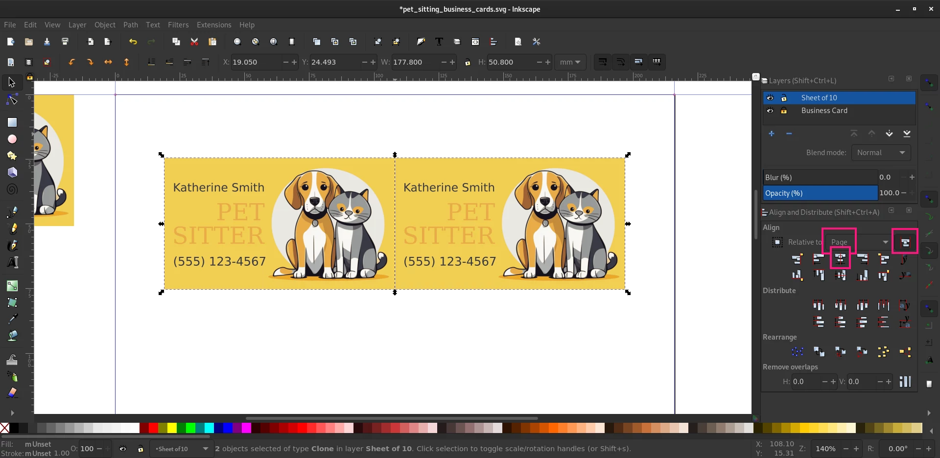
With the objects now aligned next to one another laying out the page will be a snap.
Matte – The First Sheet
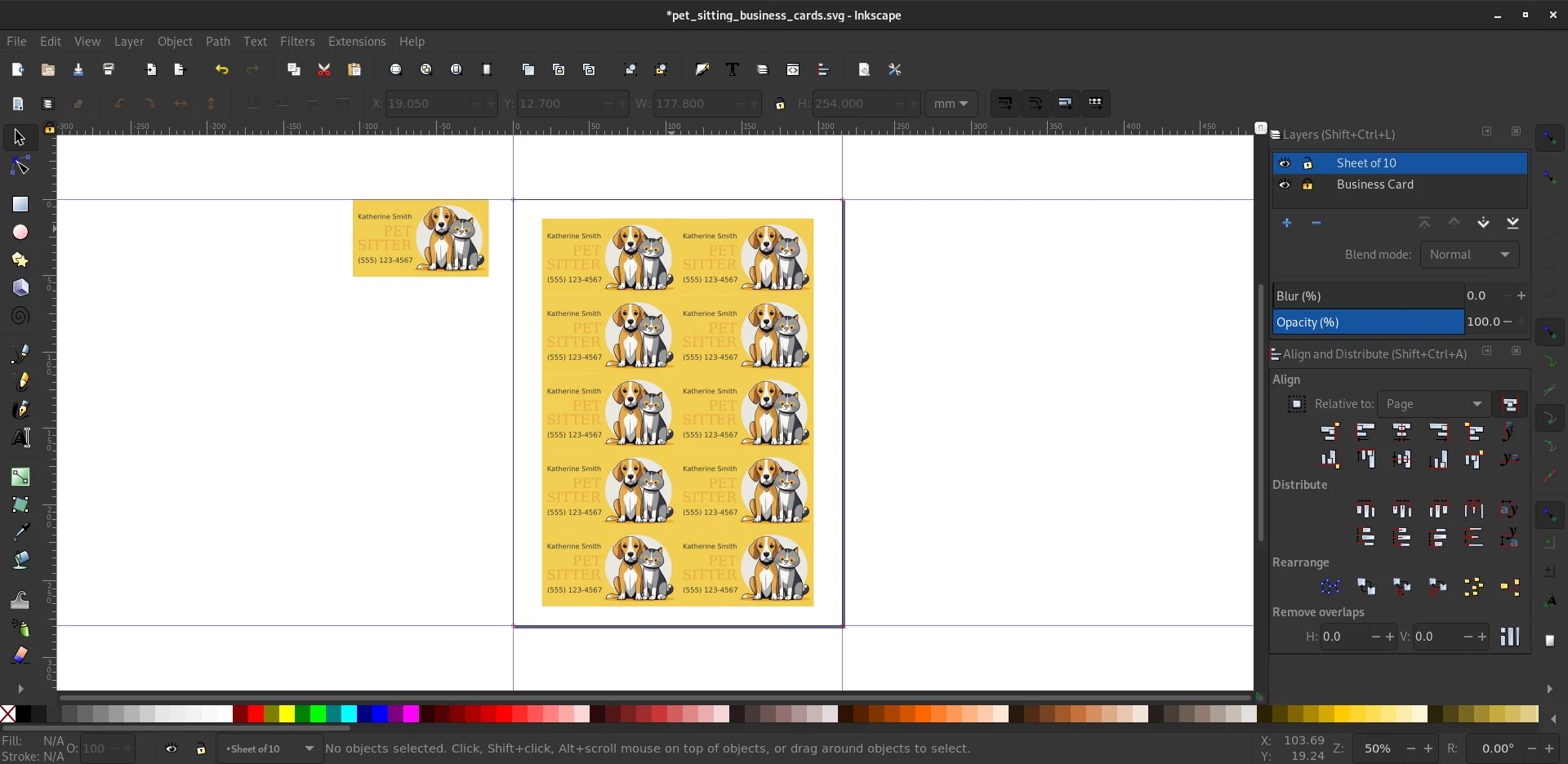
Here is what a perfectly adorable set of 10 pet sitter business cards looks like all laid out. If you recall, I said that sheets like this are best suited for matte business cards. Why? Because when you have a print so tightly packed as this page is you want to avoid cutting the edges. That is, don’t chip the individual business cards when cutting them apart. Matte paper doesn’t have this problem so you can add an additional 25% to your page when you print saving you money on your business cards overall.
Glossy – The Second Sheet
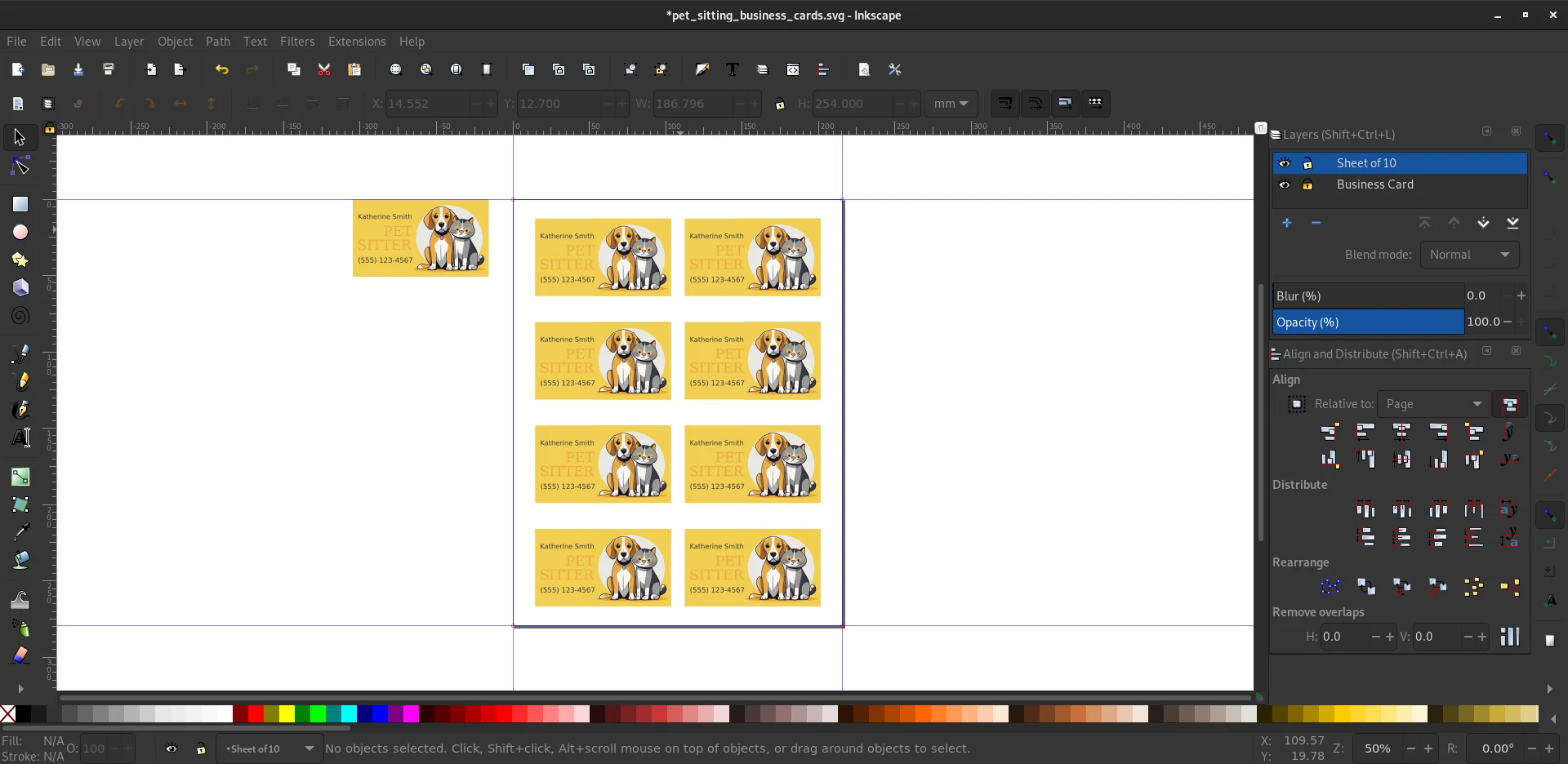
I have already explained why glossy business cards need to be spaced apart from one another. Here you can finally see what that looks like in practice. When people hand out a business card they want it to be super clean and free of any imperfections. This will help ensure that is the case when you print them at home.
Making Changes to Your Business Cards
If you recall way back in the middle of the page I said that we are going to make things easier on ourselves when it comes to updating your pet sitter card? No. Good. Then this won’t sound too redundant.
Read?
Good. Let’s make some changes.
For instance let’s say that your name is “John Smith” and your phone number is “(555) 321-7654”. Sounds like a challenge right? Nope.
With our original design selected we now need to “CTRL+Click” on the object we want to change. Sorta like so …
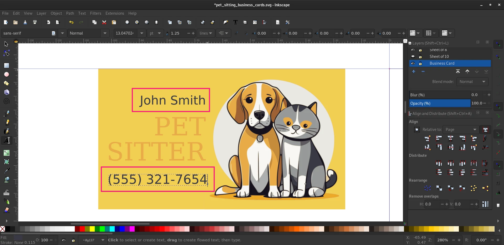
What did that do you might be asking … Well just look! Both of the sheets have been updated with your text!


FAQ
Can I Use This Business Card for My Pet Sitting Business?
Sure you can. You just need to download the source files and either install Inkscape or open them in an application that lets you modify SVG images. Follow along with the tutorial on how to make changes to the layout.
Can I Sell the Design?
No. While I have given out the the files to make your own cards for a pet sitter business, they are licensed under the the Creative Commons Attribution-NonCommercial-ShareAlike 4.0 International license. That means you can’t make derivatives of this design and sell them to somebody, nor can you take the design and place it on a POD service.This tutorial and the resulting files can be used but attribution must be given.
Pet Sitter Business Card Design by Grey Kitty is licensed under Creative Commons Attribution-NonCommercial-ShareAlike 4.0 International
What’s Up With “Designed by Greykitty.net”
Or more aptly, “can I delete it?” As I stated before, attribution must be given if you intend to use this card deign for your business. If I am helping you promote your business (for free) then you can in turn help me promote mine.
Can I hire you to make me a business card?
Sure can. Feel free to contact me and we can talk about the details!
*Cute is relative. What I find cute, you may not, and vice versa.